We create a lot of websites. Mostly they are for housing our web portal systems and as such, they generally follow a broad design/style already laid out by the end client. However, we also get commissioned to do more creative designs across different industry types - we don't have a particular industry type we focus on for this. Creating a pleasing web design is rewarding in itself. But a 'good design' also contributes to making sure visitors/users can: easily use the site; can access its features and, even more importantly, that they can easily absorb and take in the information being given.
There are lots of training courses you can do on design, with many concepts and tools. However, what is 'good design' is somewhat subjective. It's also not just - all about the look of the site. We come across lots of sites that were designed with aesthetics first and foremost. But many fail the tests mentioned above, namely; making sure users can easily use the site and its features, and making sure they can easily absorb and take in the information being given. Some common examples: icons are not always as intuitive to your users as they were to the web designer; navigation between sections and pages can be confusing if not made very obvious, and; overuse of pictures can end up with what may be a pleasing look but which results in less information being transferred. The moral, sometimes, less is indeed more.
So given this. What can you usefully use to help your web-design?
We subscribe to the view that some design techniques are indeed broadly timeless - they just tend to work. They may not work in every case - they don't need to be used every time. But unless you have well thought out alternatives, they do tend to just... work. One of these techniques and the one we are explaining here is called the 'Golden Ratio'.
The Golden Ratio, is a mathematical construction based around relative proportions. It refers to the relationship (ratio) between similar elements of different size and positioning within a design. It's this 'ratio' which is thought to be the most aesthetically pleasing for human eyes. In mathematical terms the 'Golden Ratio' equals 1:1.618. It's actually a bit like Phi,as the decimals go on for ever. But 1:1.618 or even 1:1.6 is close enough for general use.
If you do some research on the Golden Ratio you will find many illustrations show it as shell-shaped spirals (see below).
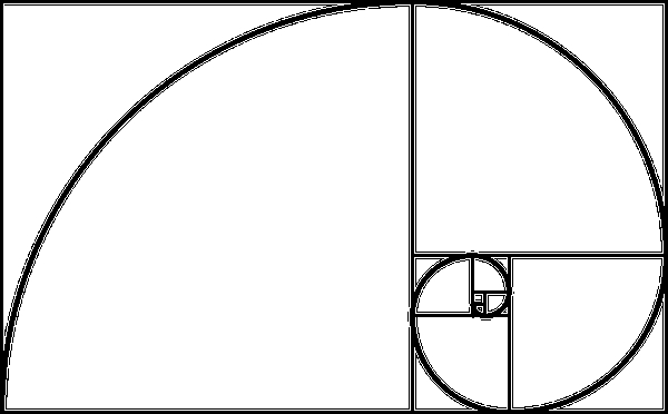
The Golden Ratio is is commonly observed in nature and is prevalent in the seashells that inspired the diagram above. Many ancient buildings as well as famous art works seem to use this ratio in their proportions. The way it works, is that each of the boxes above (or parts of the spiral) is either 1.1.618 smaller (or bigger) than its immediate neighbour.
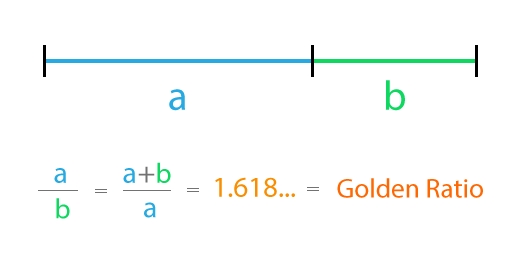
The ratio can we think be easier understood by referring to a simple line (see below). The shows more clearly the relationship between 'a' and 'b' (i.e 1:1.6).
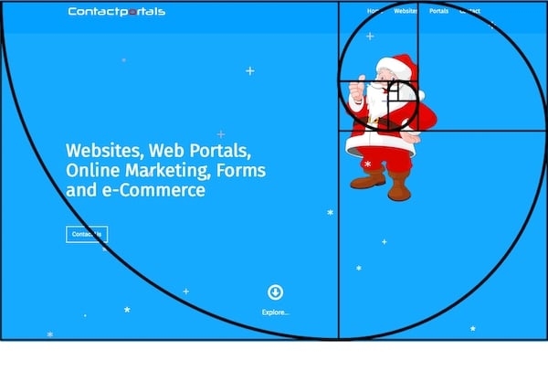
Looking at this in practice. The example below is from one of our own websites. It has a simple uncluttered front-page which makes it easier to get the point across. This post is a December one, so the site currently has a Christmas theme with falling snow and a Santa. We have taken the spiral model of the Golden Ratio (see above) and superimposed it on the screenshot. What it shows, is that site is broadly based on the Golden Ratio with Santa right in the sweet spot. In actual use, he is just one of a series of images that flip in and out. These images are where we want the attention on - its where your eye is drawn.
The Golden Ratio works great like this when you are looking at a regular laptop or PC Screen as per our example above. Interestingly, many screens have an aspect ratio (width to height) of 16:10. This ratio (1.6) is itself very close to the Golden ratio (1.618). You can of course resize a window on your PC and change the viewing overall proportions. Designing the look of webpages for users on PCs and laptops using the Golden Ratio thus often works well as an overall design rule of thumb.
However, things change when the same site is viewed on a phone. A standard iPhone8 has an aspect ratio of closer to 19:6. This is very different from that of a typical PC and very different to the Golden Ratio. As an additonal factor, many phone users will be looking at your site in an up and down portrait position.
Many modern websites are what are called: Responsive. Responsive websites, are designed to adjust the flow of elements so the site dynamically repositions/resizes to the size of the device being used. This is where the Golden Ratio can break down somewhat unless care is taken. The example below (scaled down) shows a screenshot of the same website - along with our Santa - on an iPhone.

The proportions and positioning are very different. This site was designed to change its sizing and positioning of some elements to make it easier to read on a phone or tablet. So this website when viewed on a phone, now no longer has the same proportions as it did on a PC. In positioning terms, it's thus no longer following the Golden Ratio. However, this does not mean that the Golden Ratio is not a good overall design rule to follow. Whilst the overall positioning on a phone will be different to that on a PC. You can still use the rule in many other ways. For example with images and font scaling.
With fonts, the Golden Ratio can be used to set the amount of line height to font size, or the header font size to text size or indeed to set the spacing between elements. If you are not sure what the right amount is; try using the Golden Ratio. You will probably find in many situations it just seems to look better.
You can also use the Golden Ratio with images. We have included an example below. Again we have superimposed the 'spirals' to show the relationship between the focus point and the rest of the picture. Why not try this with your own images? Remember you can flip the spiral for left or right and for up and down and it will still work. It's all about where your eye is drawn to and what the eye perceives as being more intuitively comfortable and pleasing to look at.

So if you are interested in website design we suggest the Golden Ratio is a useful tool to use. It also might explain and give context to some of your web-designer's suggestions and ideas. We don't always use it - and we don't suggest it needs used for everything, especially for an overall structure. Sometimes other constraints or design elements will come into play. But if you are looking for creative input, it is conceptually simple to use and often delivers the goods.