This post looks at some web design trends with a view to what we think you can expect to see in 2017.
It's our own view of course, and given the web is notorious for encouraging different and divergent opinions, if you don't agree with our take - that's ok too. We have however tried to reflect opinions from some of the web designers and web software suppliers we trust the most and we have only included as trends, those which are supported by others in our industry. So perhaps it's not so controversial or divergent after all...
We hope however, that we have packaged this into a readily accessible post. One that will inform both the non-technical user as well as those whom have had a bit more experience in either; commissioning websites (our clients) or providing web content. If you are an active web-designer please note we have omitted the more technical aspects and trends. We have also only included a few visuals. Including full examples, would simply have made this post too long.
Website Structure
At last the penny is dropping about using templates. Many of them just look so: 'same as...!!' We picked up several projects recently where clients have previously used web template products to build websites. They ended up not being happy with the results and then brought us in to deliver what they were really after in the first place. One thing that has struck us; they all spent huge amounts of time messing about developing what has ended up being replaced. One even had a full time member of staff doing virtually nothing else for close to a year. Anyway, in the commercial world at least, there is now much more of a widespread appreciation that it does actually take a fair amount of skill and experience to develop and deliver good sites. So that said, on to our trends:
Responsive
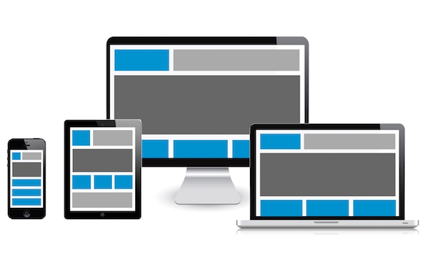
Or mobile adaptive design - has been standard from us for some time. However we are seeing more and more clients replacing their older desktop fixed width web designs with responsive technologies. Frameworks like; Foundation, Bootstrap and UIkit are gaining in popularity and provide toolkits for designers like us that facilitate the responsive model. If you are not sure what 'Responsive' is, just try shrinking your screen, or viewing this post on your mobile - it will adapt to the screen-size and device you are using - that is in essence Responsive design.
One-page websites
These were so popular with designers in 2015 and even into 2016. Yes, they can look really nice and aesthetically they are a much 'cleaner' design. One-Page sites rely on very large scrolling pages and were seen as being particularly mobile phone friendly. However, they have in our view not been so good at supporting search over the web. There is also some evidence that users tend to skip very quickly through content and not engage as much. A single large page with all your content on it, will in simple terms, water down what you are trying to say. From what we are hearing, this 'fad...?' is largely over and websites are going back to multipage.
Pop-up windows are on the way out
Not only has advertising given them a bad name but they; don't work well on mobiles and they are increasingly problematic to use. As an example: we had to announce last year we were removing popup information screens from some of our Portal products due to Google Chrome dropping support for some popup triggers. We ourselves have mixed views on this. Used responsibly they were a useful tool. However we suspect that many of you will be very happy if it also helps curb all those dreadful popup adverts.
Menu structures
As we outlined above, we see a return to multipage websites (though to be fair, one-page designs were never a big thing for us or our clients). Multipage sites do of course need a menu so users can quickly navigate around the pages. The traditional means is to use either a vertical or horizontal menu. We were never keen on using vertical ones due to issues with incorporating within a page layout. However, when responsive sites came in that included special menus for use on mobiles we got the Hamburger icon. The Hamburger is those 3 small lines, one above the other, than denote there is a menu there. Initially we were not sure the icon would really catch on and we used to replace it with a more descriptive "menu" button. However, we acknowledge things have moved on and that you can now assume that your website visitors will know what this icon represents. This means we don't necessarily have to have a full menu on the page and the visitor can access the menu by just clicking on the icon. Incidentally it is now almost the expectation that the icon will either be at the very top left or top righthand corner of the screen and above all other items including logos.
Lastly Skeuomorphism
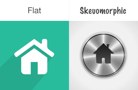
Yes, its a mouthful. But bear with us, it is a term you may already have heard of in passing. But if not, we think you may come across it in 2017 especially in discussions round web design. Skeuomorphism is a design concept. It's where items are made to resemble closely their real world counterparts. We have put an example below of two buttons. The one of the right is styled to look like a real world button. It has contrast and a look that suggests it stands out and is ready for you to push. The one of the left is also an button image but is referred to as "Flat" in terms of its look. It does not standout. The fashion in 2016 and in the couple of years leading up to it, was very much for building sites with a Flat look. If you look at IT design history, there has been an ebb and flow between use of Flat vs Skeuomorphic design ever since the first Apple Mac. Indeed with iOS7, Apple released a 'Flat design' and that really encouraged Flat as an overarching style. We - and others - however, think designs can now be too Flat and that there is evidence to show that the pendulum is swinging more to the center in 2017. So please don't feel you are missing out by not going full bore on a Flat design.
Images
We think we will see more use of 'Hero' Images being used in 2017 - especially on the front page. A Hero image is one that is set to cover the whole page (or most of it). Used as backgrounds, they can provide a powerful way to garner interest and develop a sites overall look.
Stock Images
These are the ones you can buy from the image libraries (see the example one we have included from istock below - bet you have seen it before). We use stock images a fair bit and Clients expect us to use them in projects. Clients also sometimes do an internet search and "take" images off other sites (very naughty but we all know it happens). If you have not got any images of your own, then Stock images are your go-to-solution. They are mostly good value too. However, we suggest there is growing acknowledgement by both clients and designers that using the same images as everyone else does not exactly elevate your site... If visitors have seen the same image a couple of times before on other sites, we suggest it might increasingly suggest a lack of authenticity on your part. We are starting to see more clients using their own unique images. So this is getting through more and more. Using a professional photographer for this is great if you can. But even using an iphone to snap some pics can give that genuine authentic view of your organisation/product.

Video
Video is already strong but it will only grow. Background video used correctly and in the right context can be great for enhancing a site. Clients often think that they need to get the likes of the BBC's Natural History production team, in to get good video copy. We think that view is very much mistaken and is also these days out of date. Not only are there many small local video production companies that will produce and direct a video for fairly low sums. You can also do a lot with just a humble mobile phone and some fairly basic software on your PC/Mac to stitch the video snippets together. You don't need to be particularly creative either, or even use actors. In our view being authentic is what people seem to crave. Take some shots of; your office, your products being used, your clients, your staff and cut and paste the parts together with or without a soundtrack and you can have a really engaging video that you can use on your website.
Illustrations
We saw good use of these on sites two to three years ago and it's coming back again. Well done, using illustrations can turn a plain website into something really quite special. Like images, we suggest it's best to get these created for you rather than try and fit things round ones from a Image Stock Library.
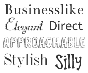
Fonts
We think more corporate clients are catching on. You don't really need to license expensive fonts to develop your brand. There are lots of excellent publicly available fonts you can use. We are Google fans and we like their Font Library. Not all their fonts are as well made as each other. But they do have a good selection and ones that people seem to - just like.
Parallax Scrolling
This used to be a mark of a good web-designer. Disclaimer - we used to promote these heavily ourselves. Client's used to love the look, and it lent an air of sophistication to a design. Parallax is where the foreground and background scroll at different speeds, giving the viewer the illusion of depth. Done well, it still gives a great look. Indeed, it used to take a fair degree of technical knowhow to do this properly. However, it's now much easier to do now using templated type effects. It is also used in far too many sites, and we would suggest it is now an overused effect. There is further downside to Parallax as it requires an increased load time to build the effect on the webpage. This is not ideal for mobiles especially if the page is already a large single one-page site (see above).
Well thats it - our view of Web Trends for 2017. We hope its provided some thought and helped inform you of some of the main developments and trends that will shape website design in 2017. If it has also given you some design ideas for your own site then that is a great bonus.